Project overview and goal
The purpose of this project was to improvise on the existing reporting and the billing data by designing and developing simple, interactive and easy to analyse dashboards thereby reducing human cognition in data visualisation and increase the digital automation in reporting and billing life cycle.
Role and the wider team
Barry led the UX/UI side of things. The other members included a CX person, Customer outcomes, Client leads, Data automation team, Delivery Enablers, Product Owner and End to End Architects.
Organisation big vision
To help all of New Zealand win big in the digital world.
Design Process
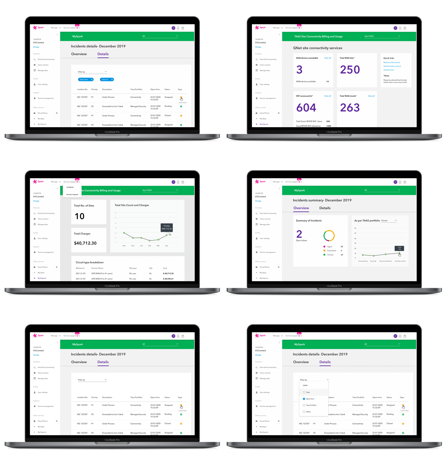
We adopted the agile working model to achieve our project goal. The Design thinking framework we followed was called Five D's which translates to Discover, Define, Develop, Deliver and Determine.
The Five D process
Discovery phase: Qualitative research
The main purpose of conducting Qualitative research was to question the brief and gather as much information as possible. Co-create workshops encouraged effective collaboration. The outcome of the workshop was to define a clear problem statement.
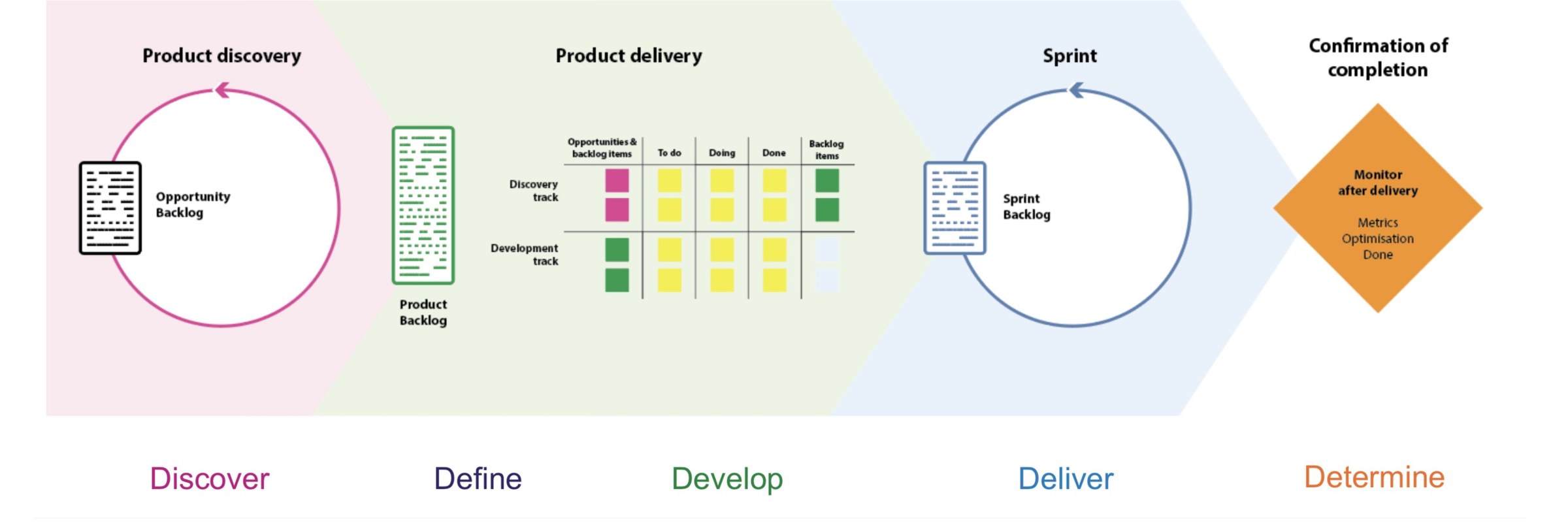
The Risk Matrix approach
- X value: Low Pain to High pain
- Y Value: Low impact value to high impact value
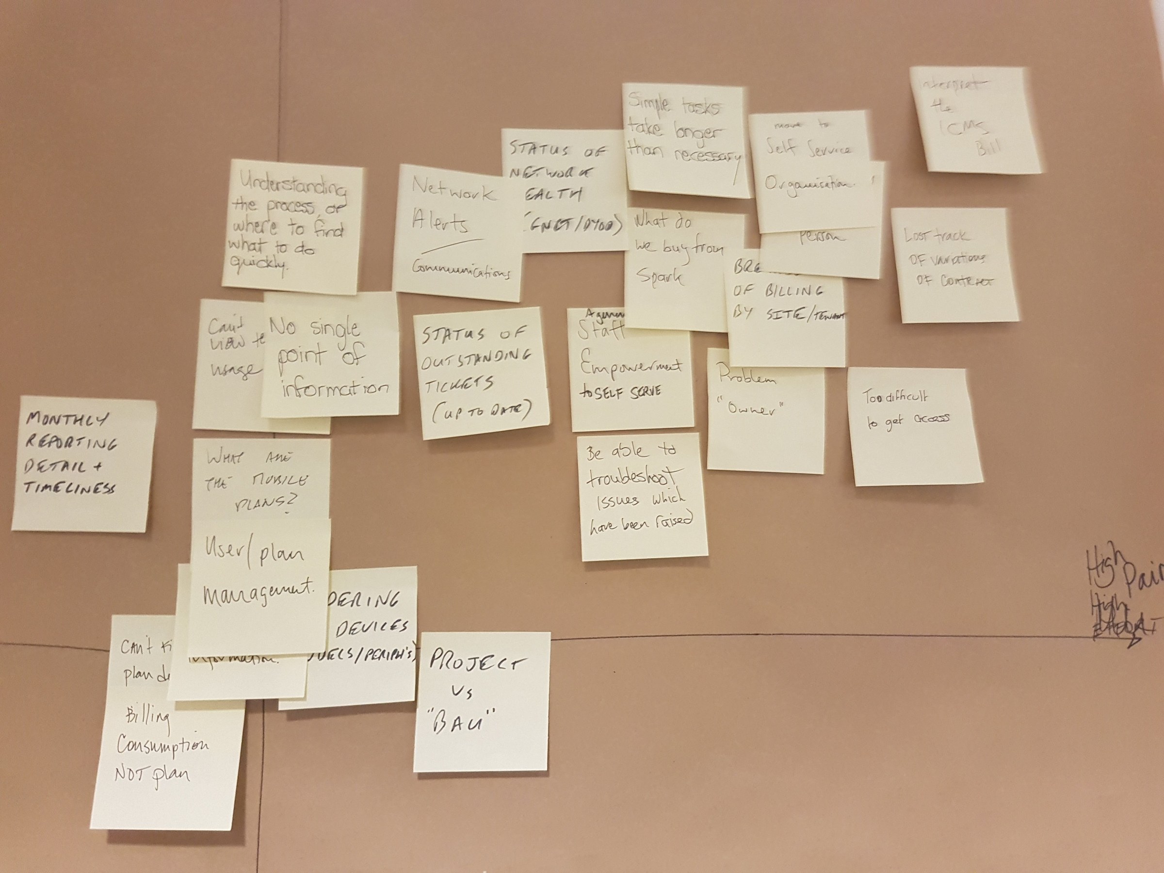
Users pain points mapping session. Risk Matrix workshop one.
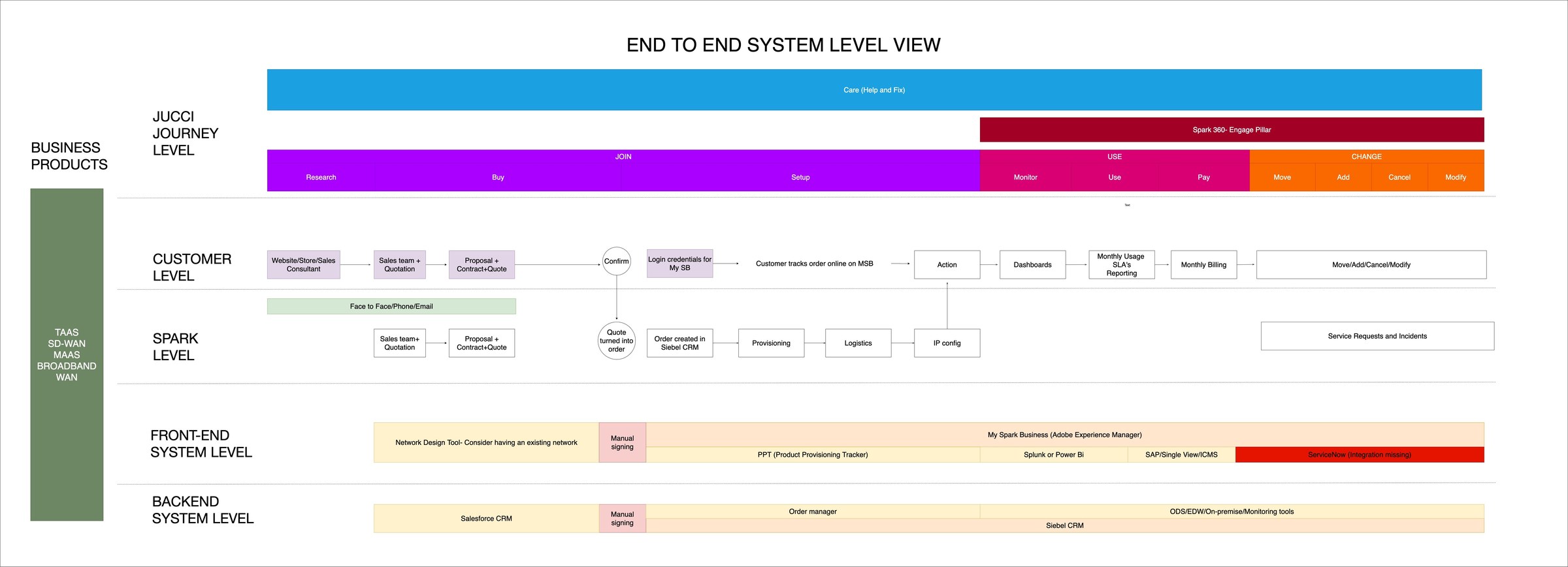
Journey mapping helped gain lots of insights on the user touch points and identify the manual steps. This created a huge opportunity to identify key pain points and channels to improve the user interactions.
Identified high impact pain points
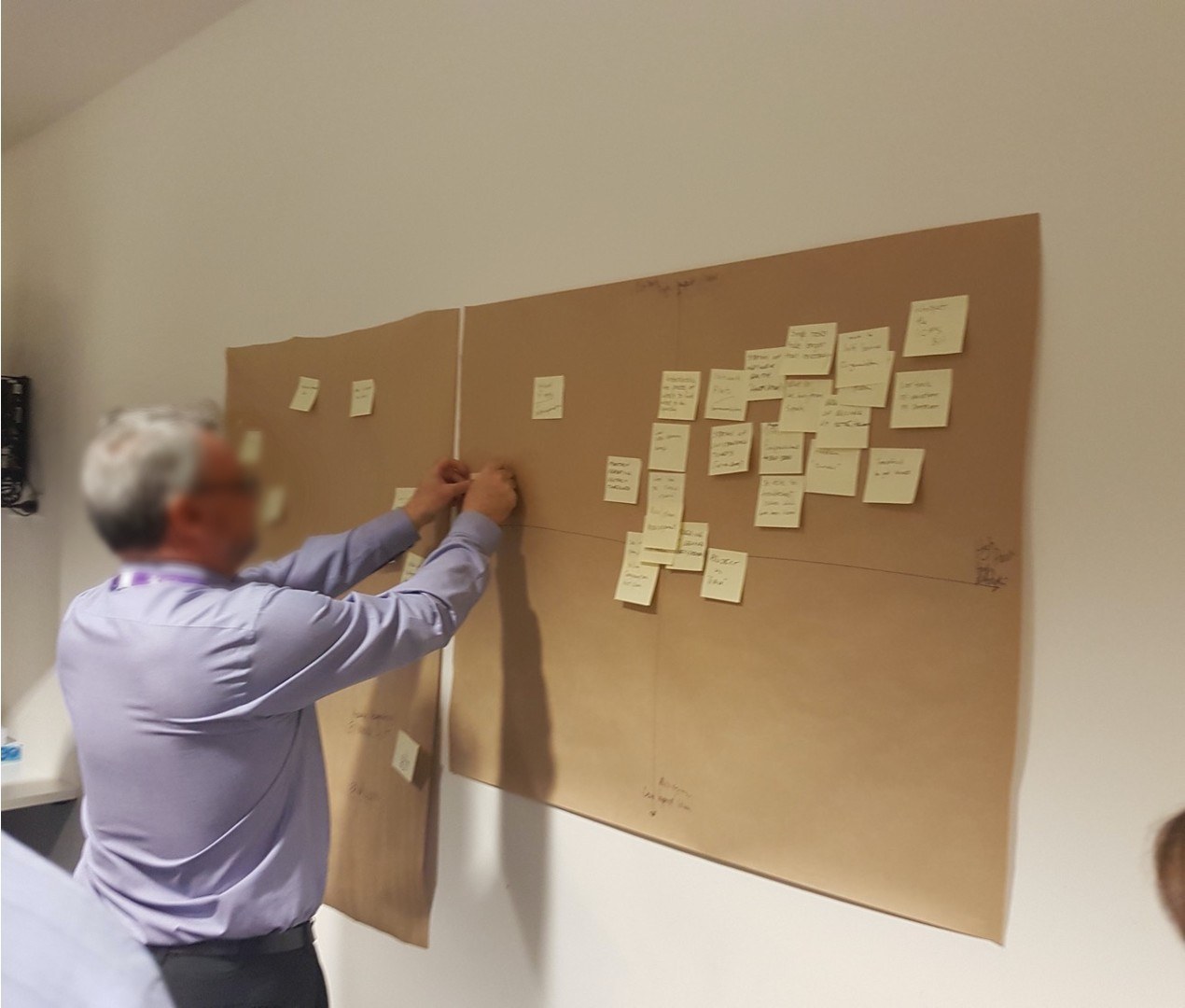
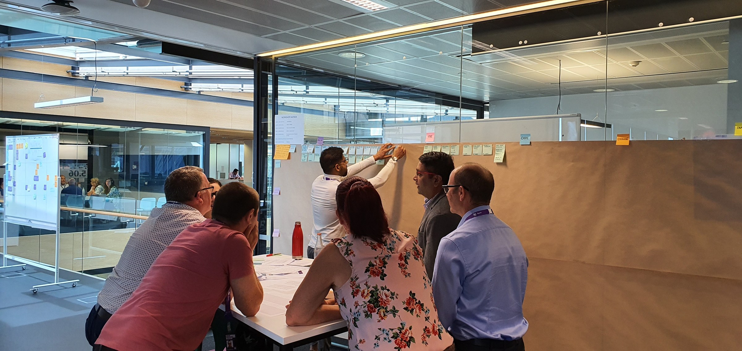
Journey mapping workshop
UX wall. Journey mapping session to identify the pain points on using the existing portal.
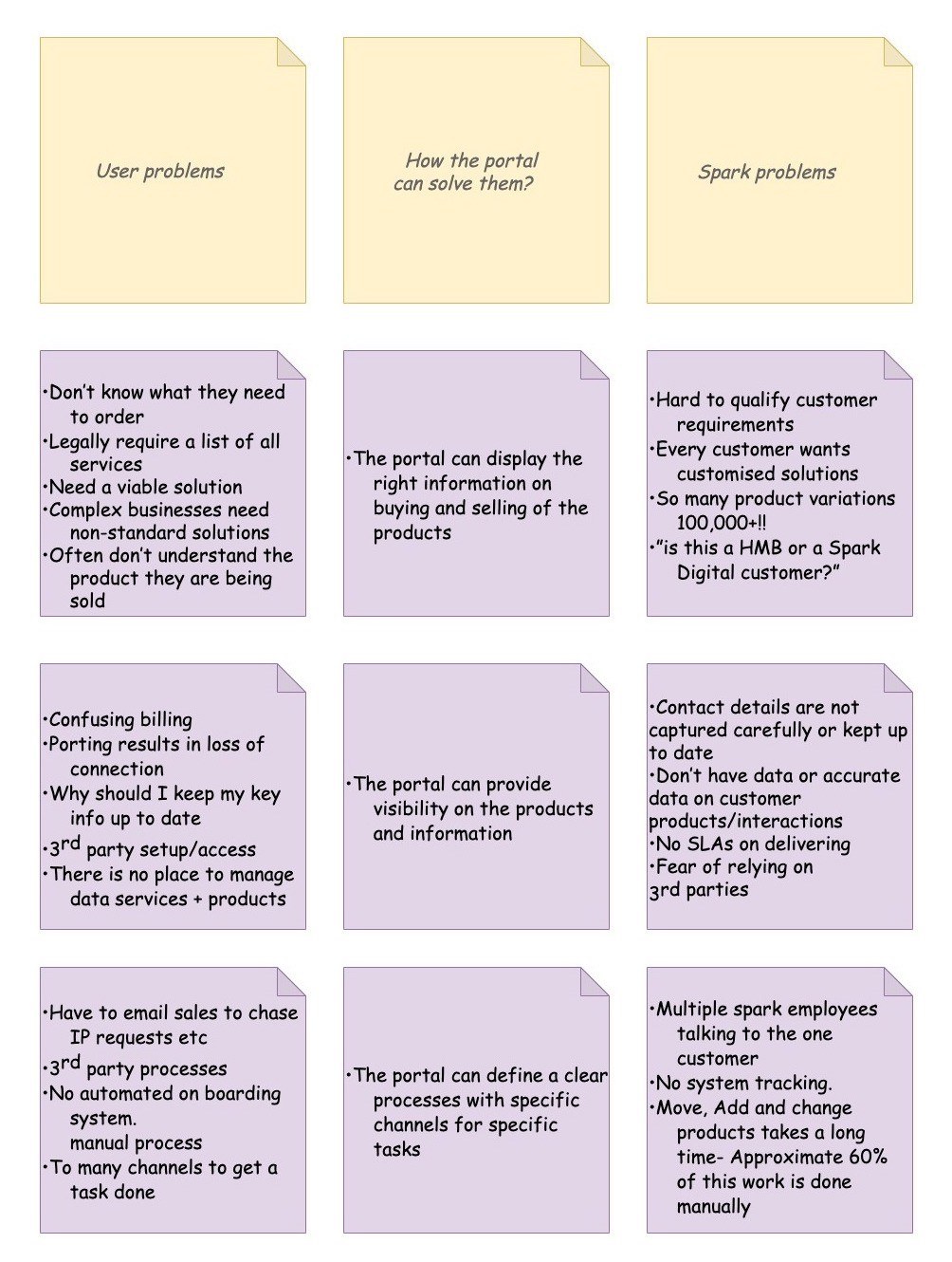
The define phase allowed us to narrow down our focus on users and business pain points and find opportunities how the portal can solve these issues.
Outcome of finding balance between Business goals and user goals and how the portal can solve them.
We were able to learn about the current usage traffic of the portal. Due to the information confidentiality the numbers cannot be addressed in this case study.
Define phase
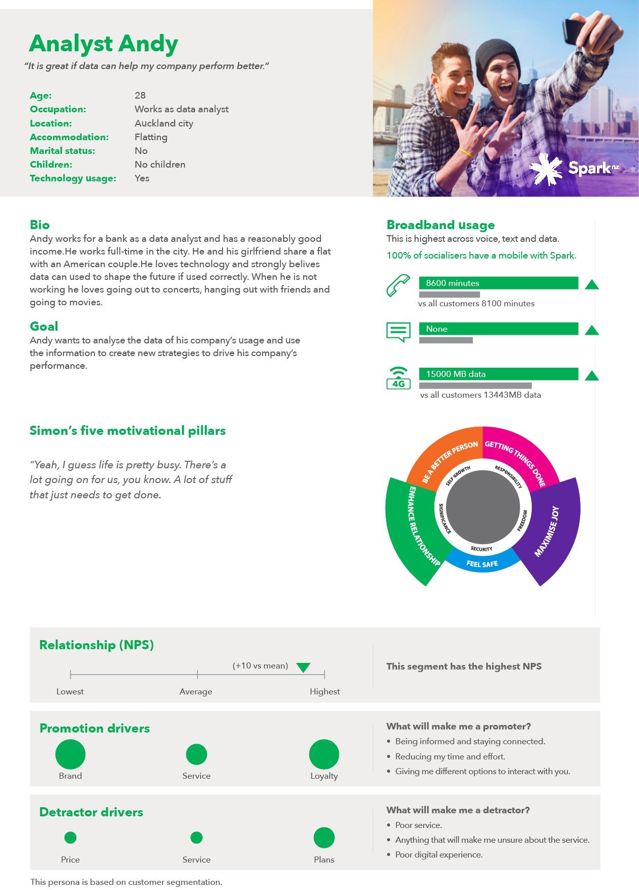
Based on the research and the user need statement we created a persona and performed a journey mapping session. The job was to identify the pain points and find opportunities in the journey where we could address and solve the customer's problem and understand their needs.
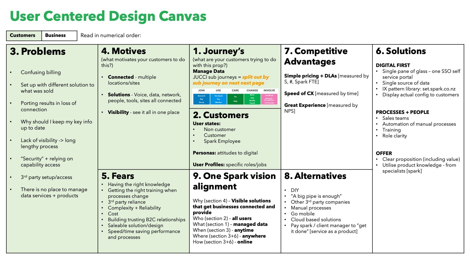
UCDC canvas
UCDC canvas to define
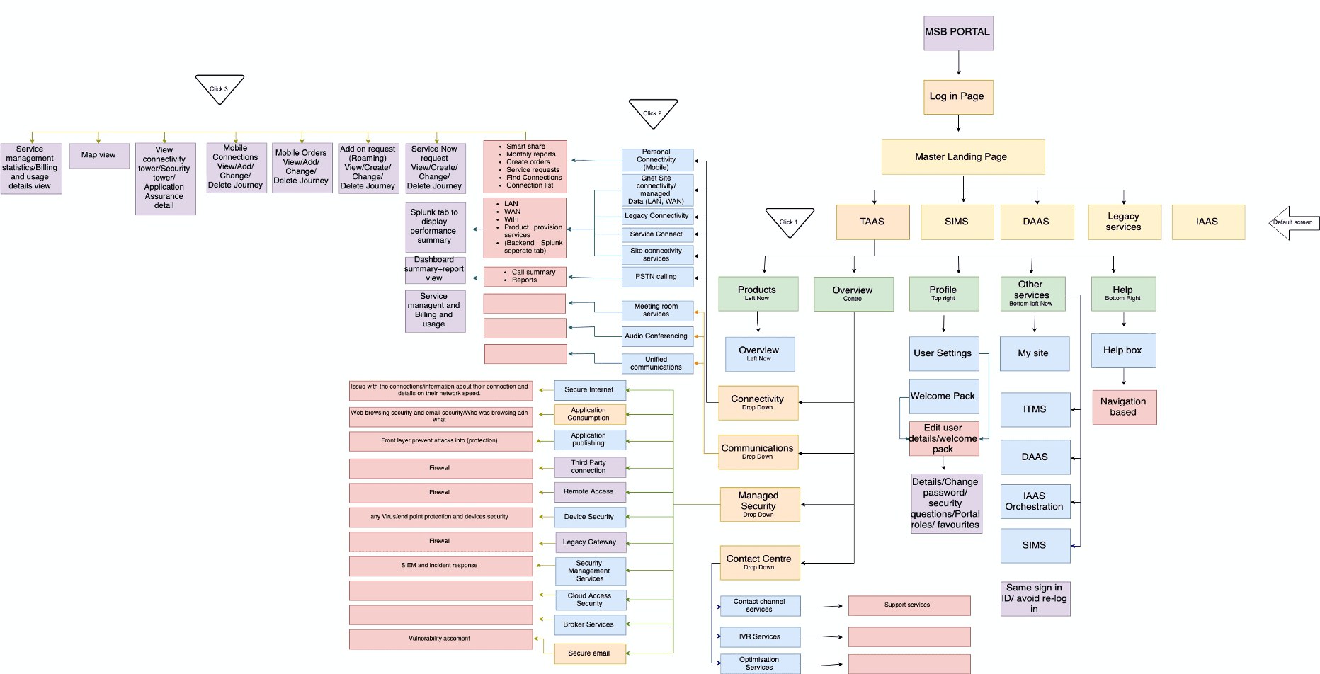
Information Architecture
Hierarchical UX
Portal Information Architecture
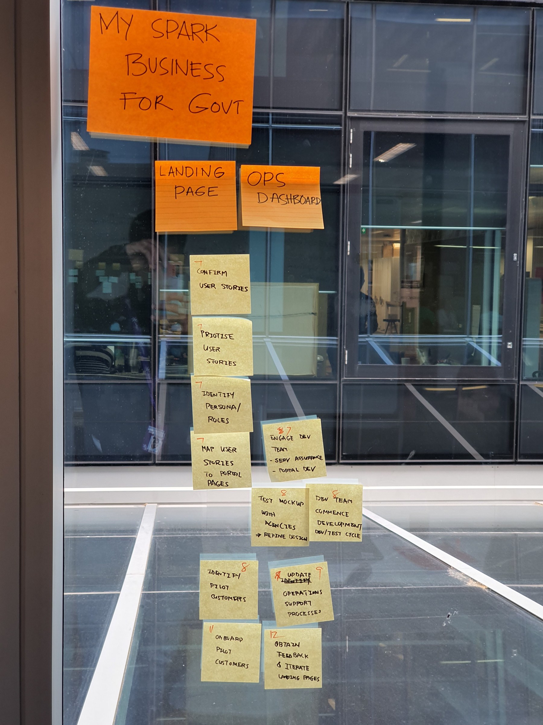
Big room planning priority board
Prioritisation board during big room planning session.
By identifying the high impact pain points we could list the top 10 pain points as a Minimum Viable Product (MVP):
- Right Billing information
- Right usage history
- Real time information
- Simple user interface
- Export data into suitable formats
- Reach help desk
- Show yearly trends
- Summary vs detailed breakdown
- One stop shop portal
- Single sign-on and role based access
Design phase
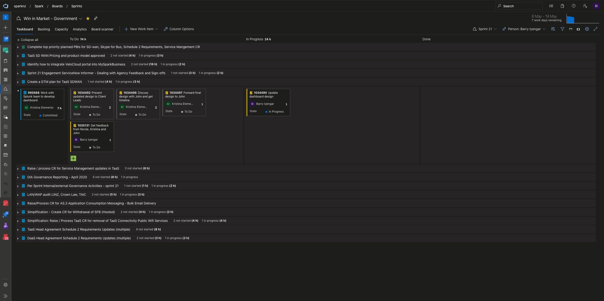
Ways of working: Agile sprints
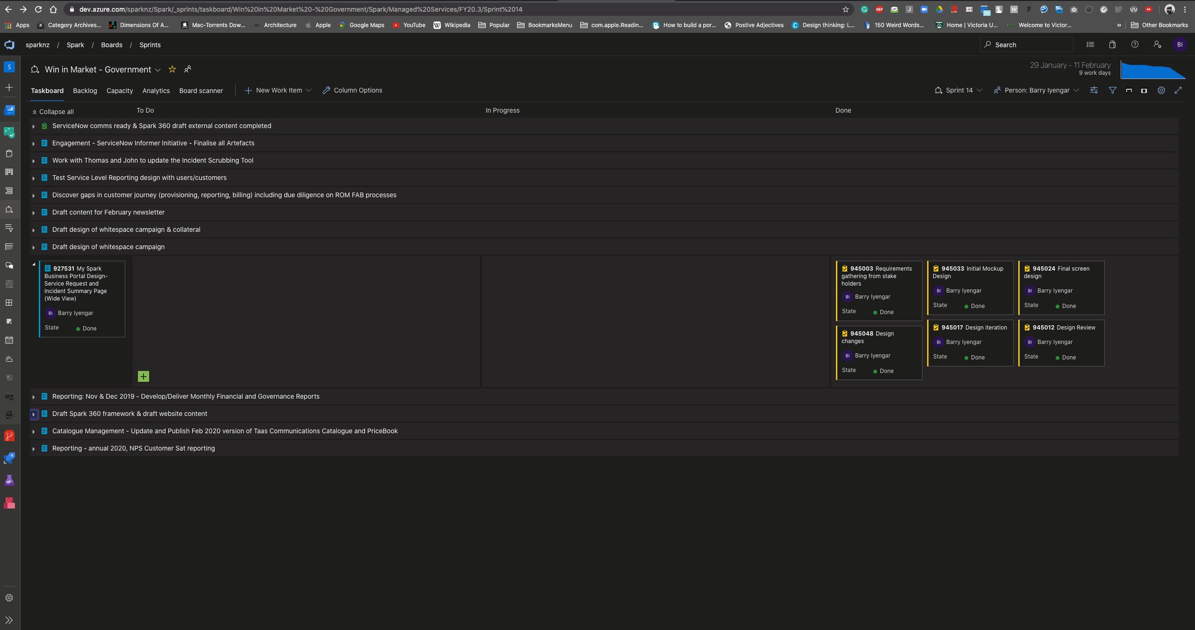
To keep track of the project and have a delivery timeline, Azure boards was used.
UX Strategy
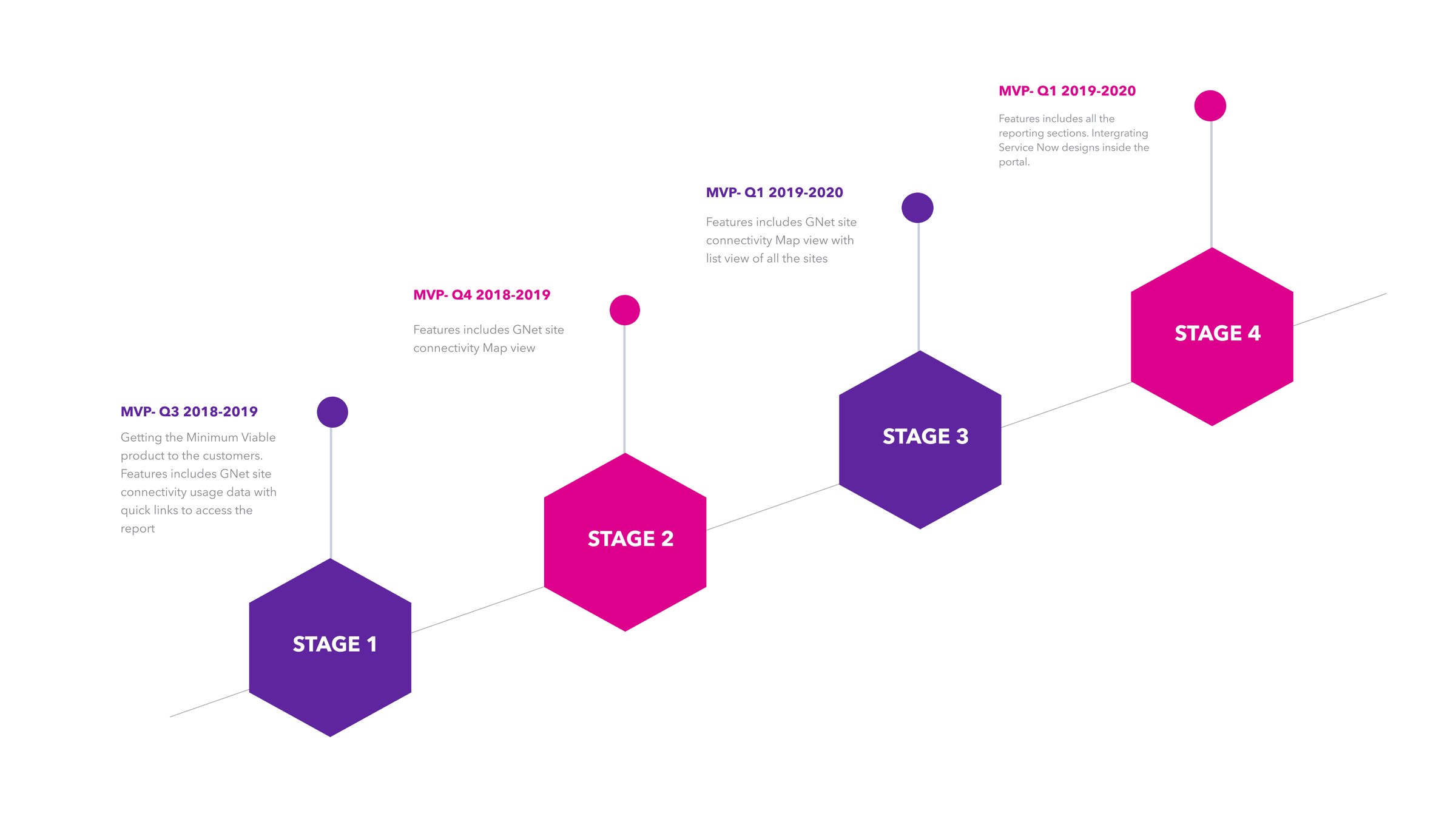
As lead designer the job was to plan in advance and design future proof so the dev teams can catch up. Planning in advance: MVP to future feature sets.
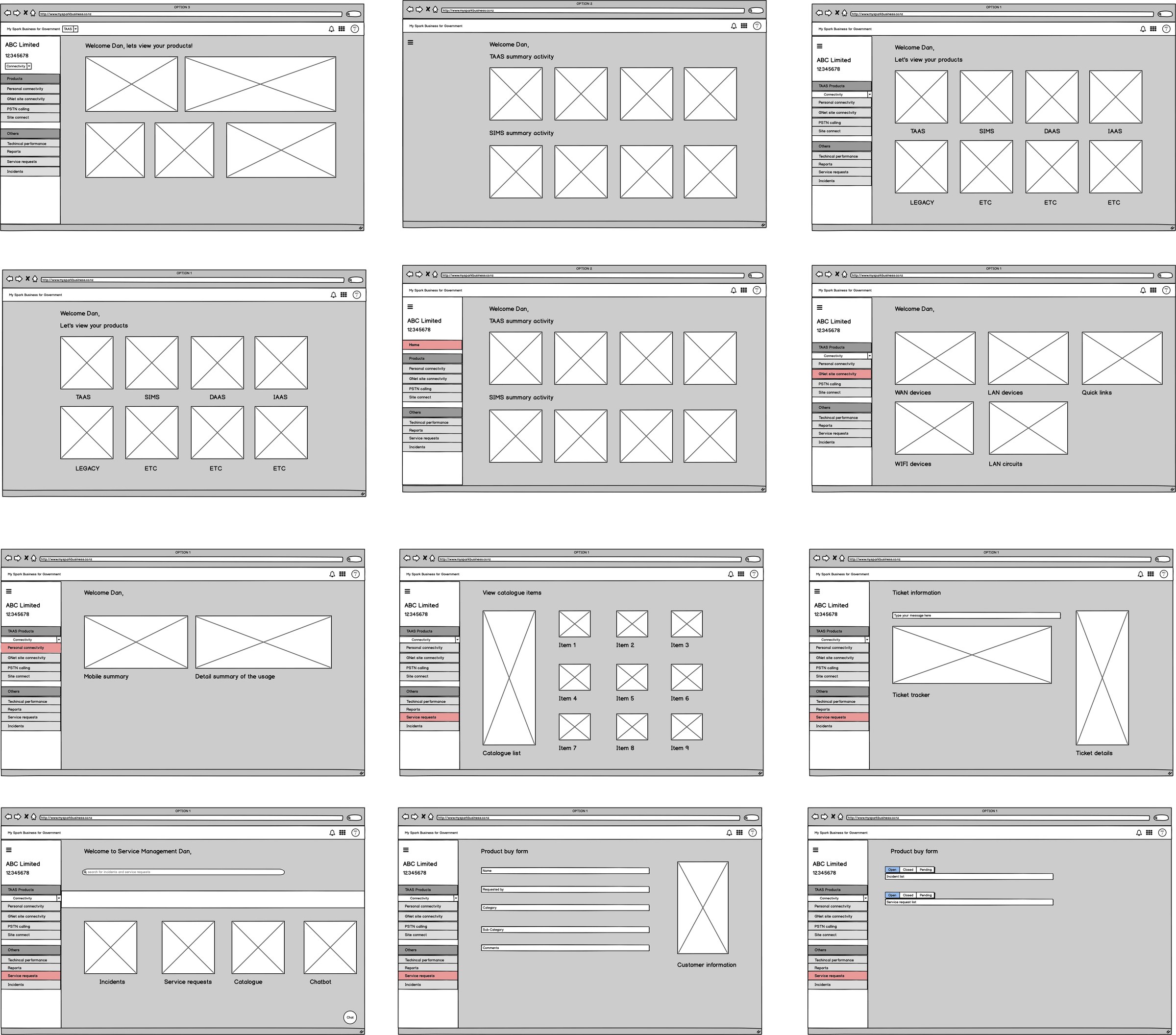
Low fidelity wireframes
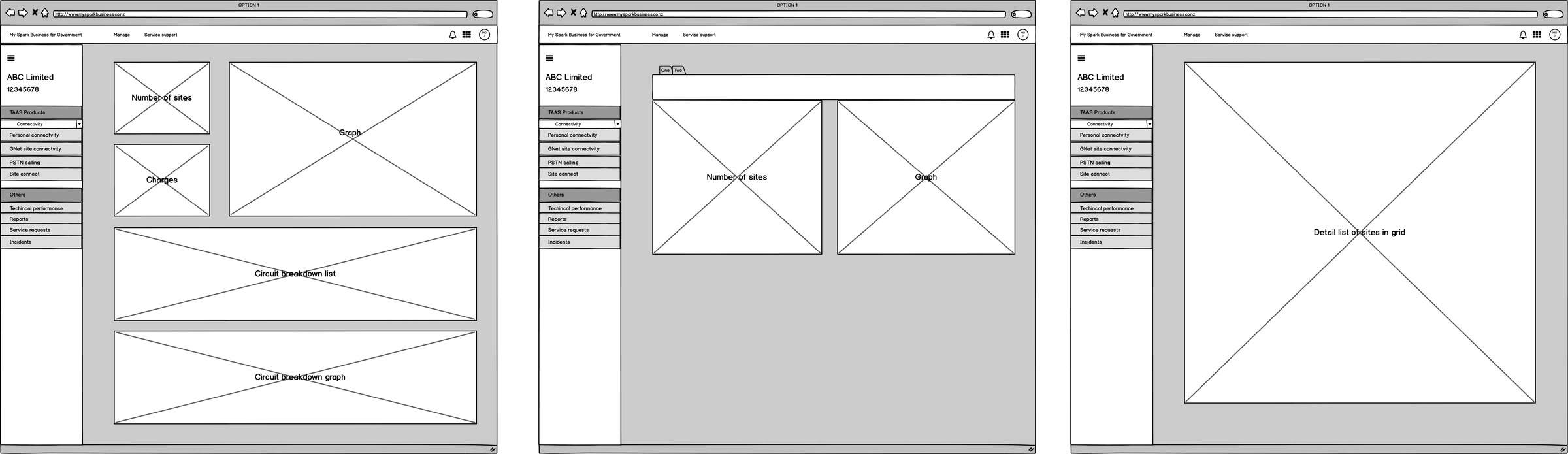
Low fidelity wireframes in Balsamiq
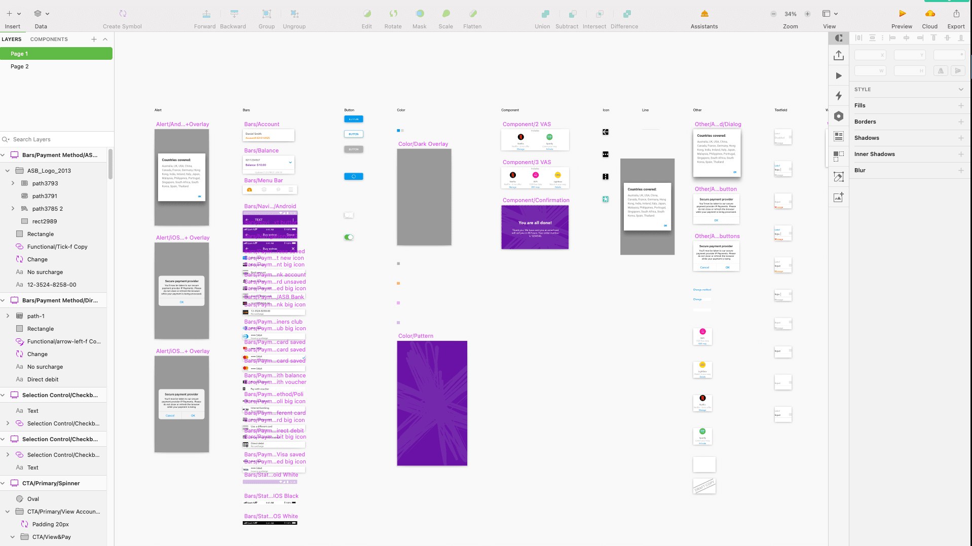
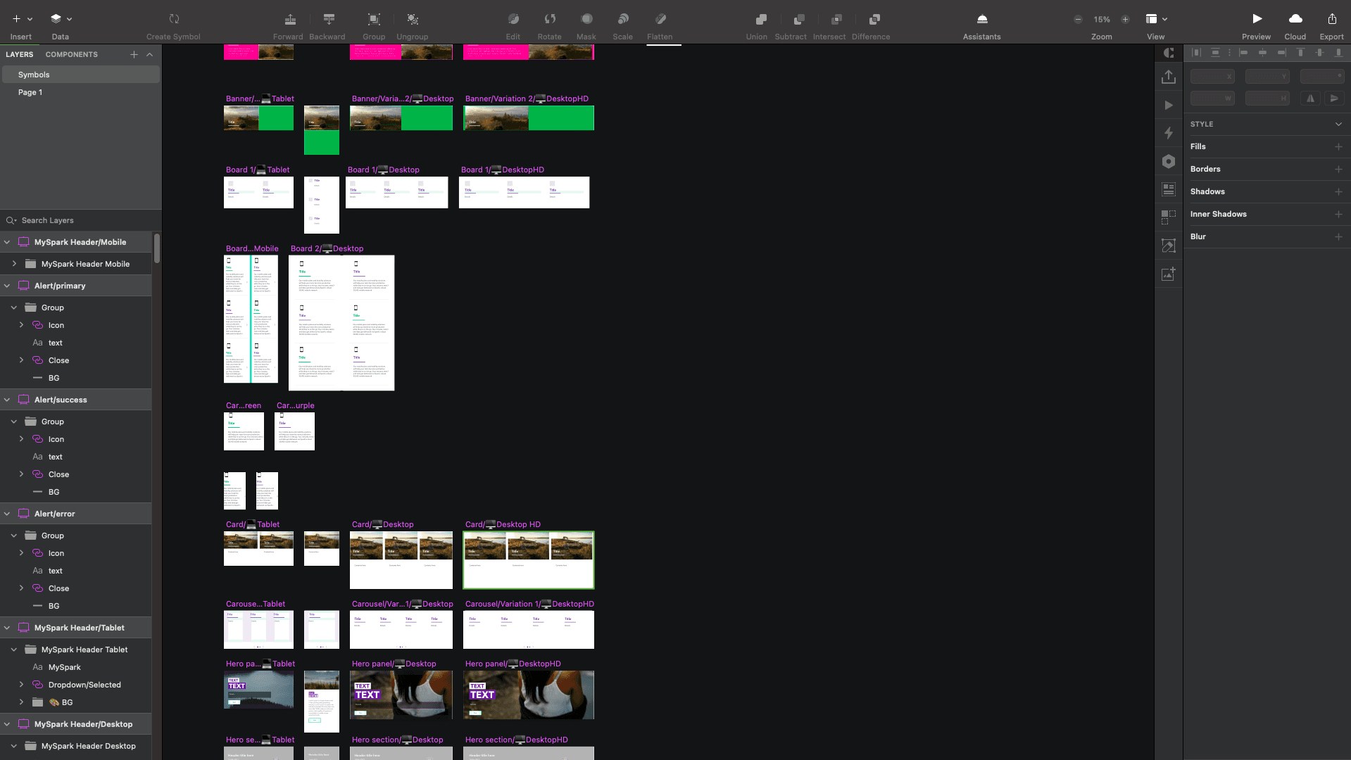
Design System
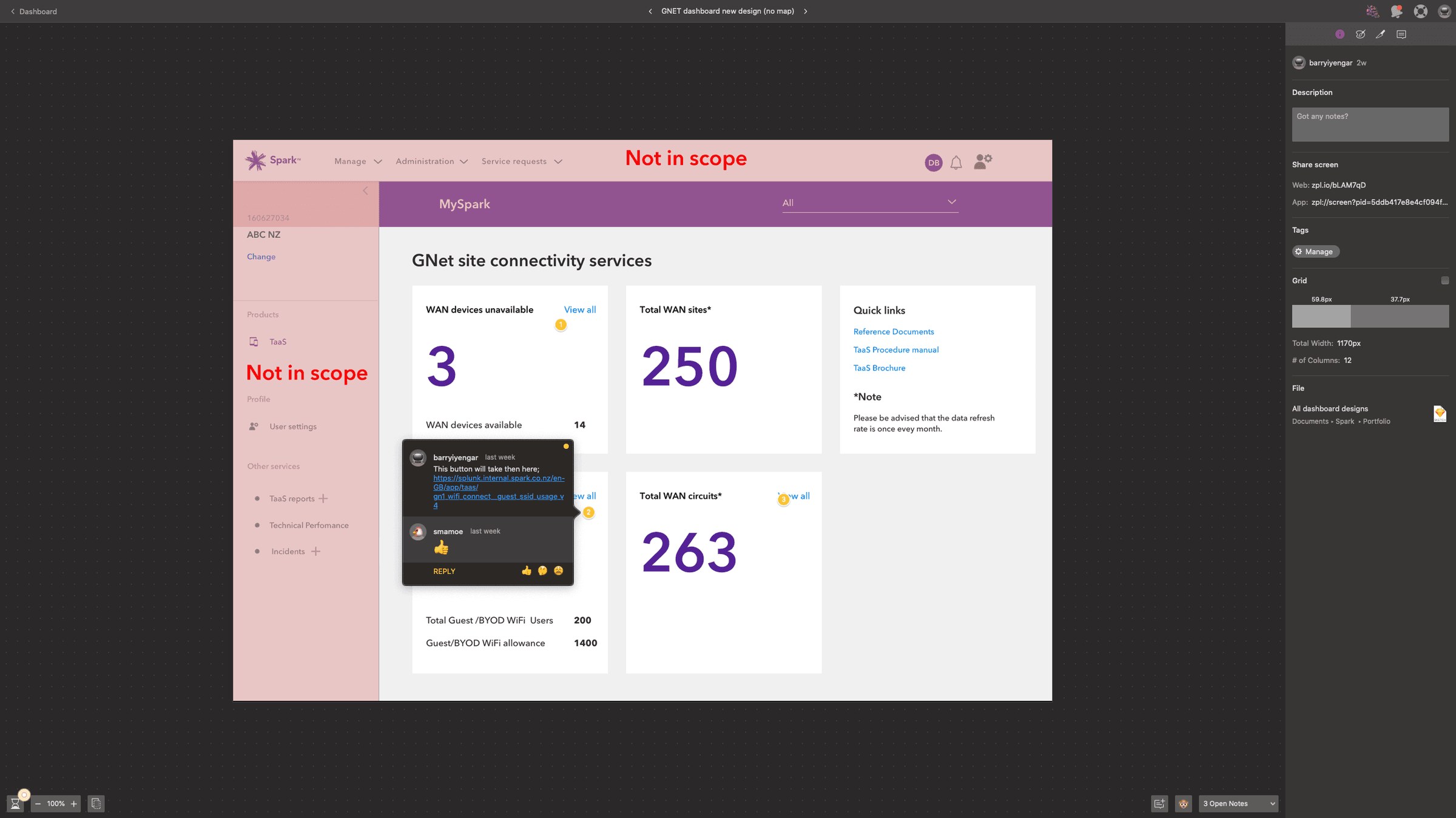
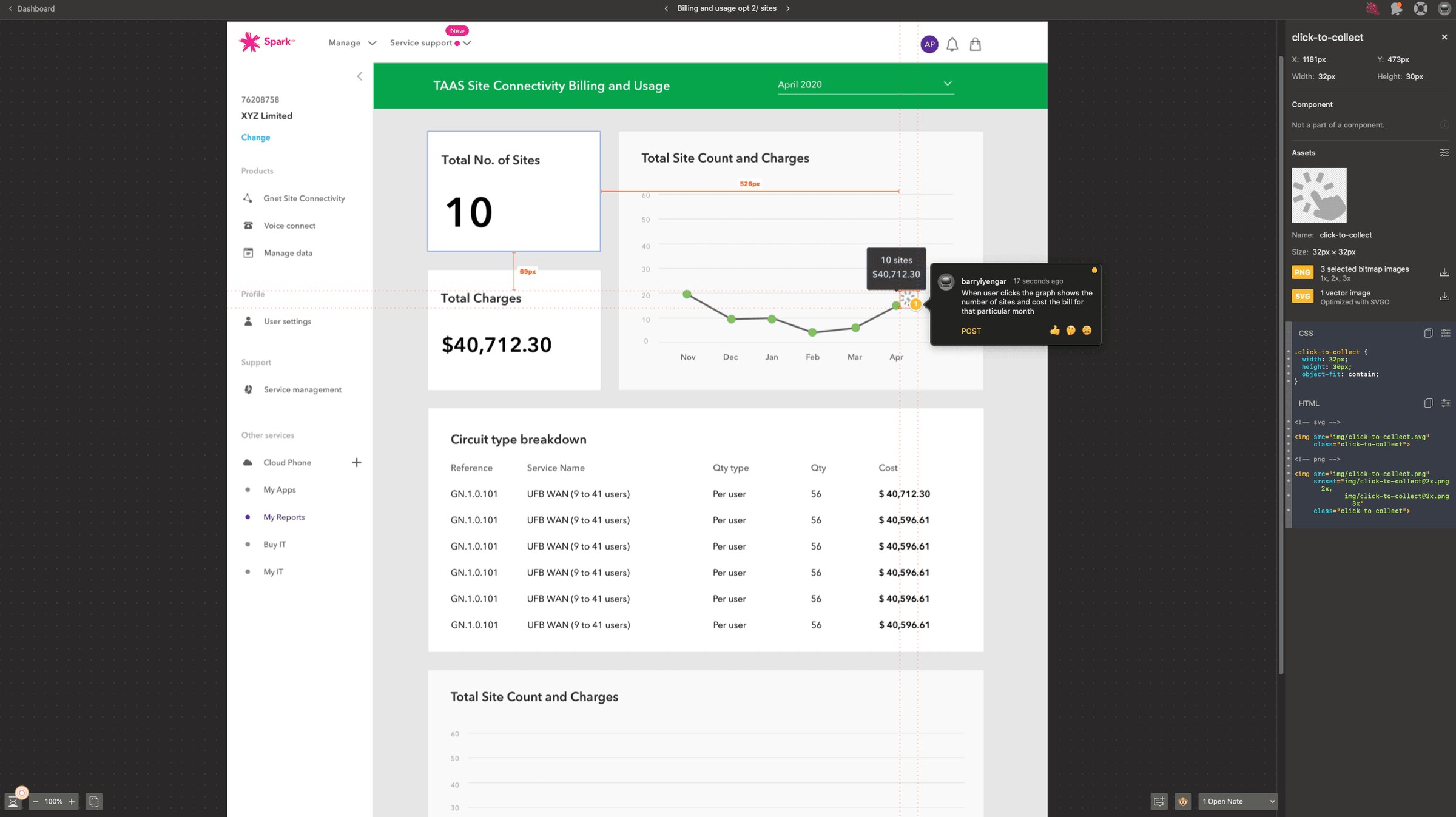
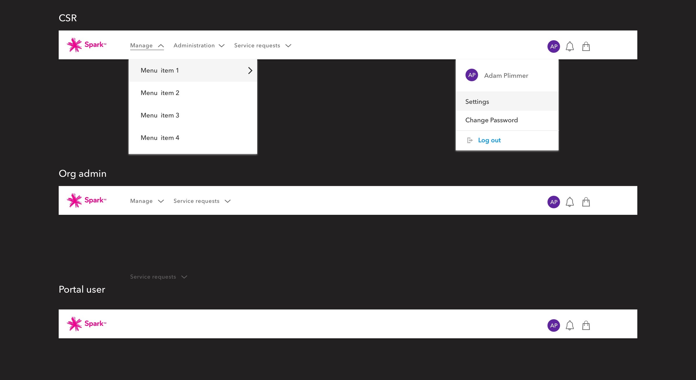
We had inhouse brand guidelines and visual style and reusable components in the design system. This saved the designer a lot of time and made design work efficient.
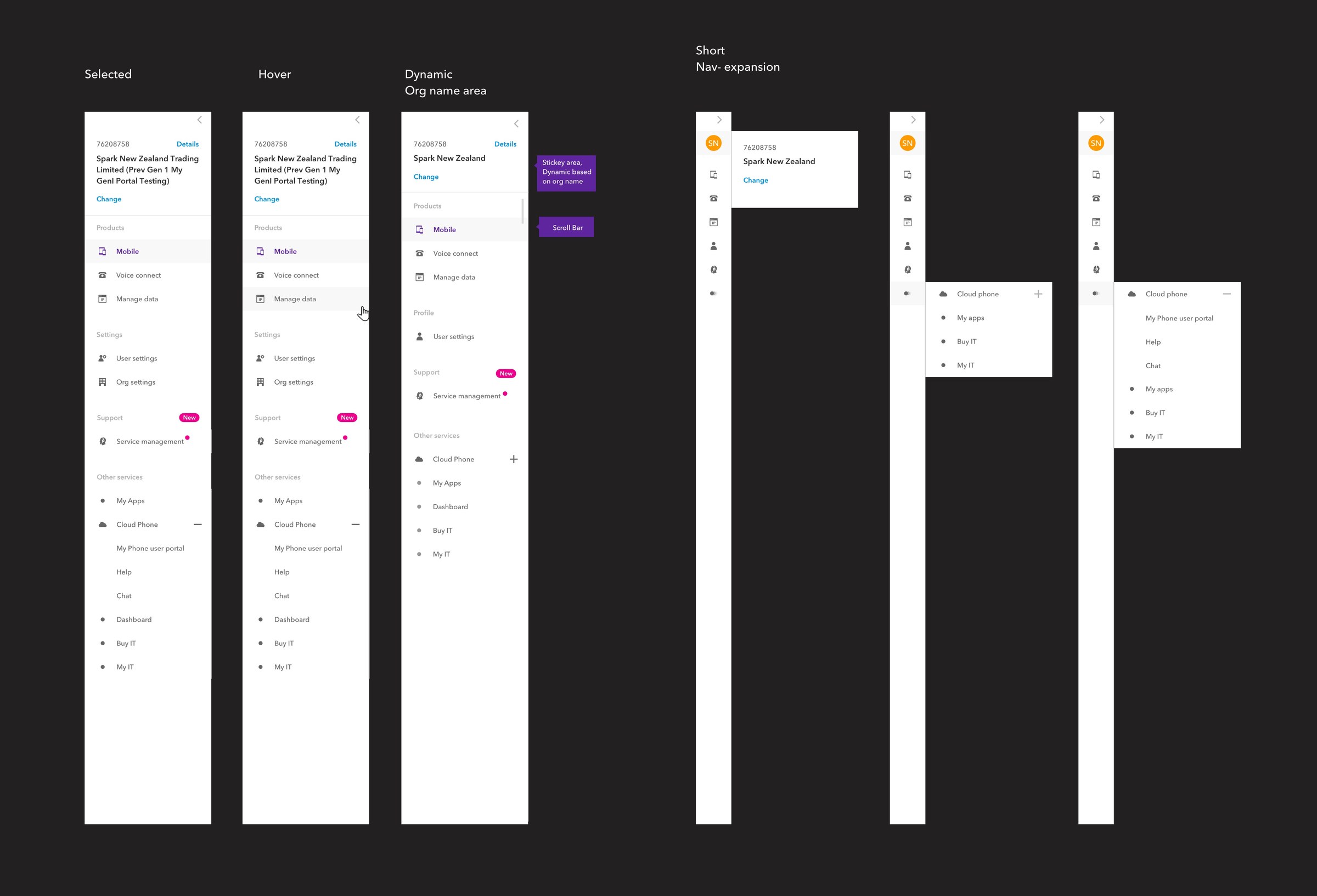
UI Anatomy
The designed left nav is used across all the Spark self portal products. Tools: Sketch, InVision, Zeplin.
User Testing
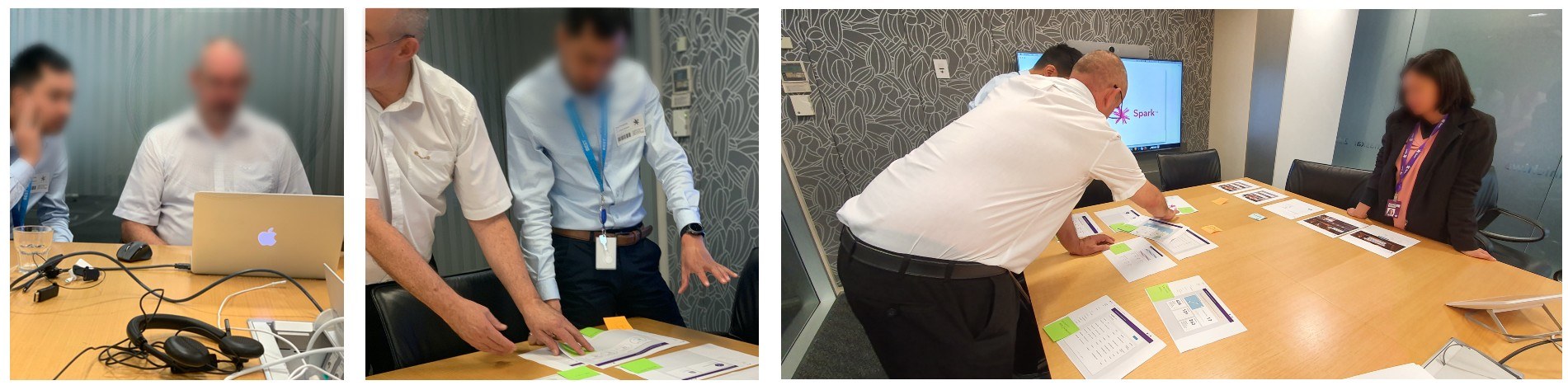
Barry conducted a moderated usability test session with five users, to seek feedback and validate assumptions with the prototype. The purpose was to test the prototype and seek insights on the users flow to capture information.
Key learnings
- Users were expecting the items to show up in few clicks
- Users were struggling to get clarity to understand some information in the low fidelity wireframes
- Users appreciate appropriate CTAs
- Early testing helps gain customer insight in idea level sufficient enough to validate our assumptions
- Users are looking for most amount of information in least amount of time.
- Users needed instant view so it careful not to use too many visual elements.
- Users care more about the summary rather than detailed views.
Future features
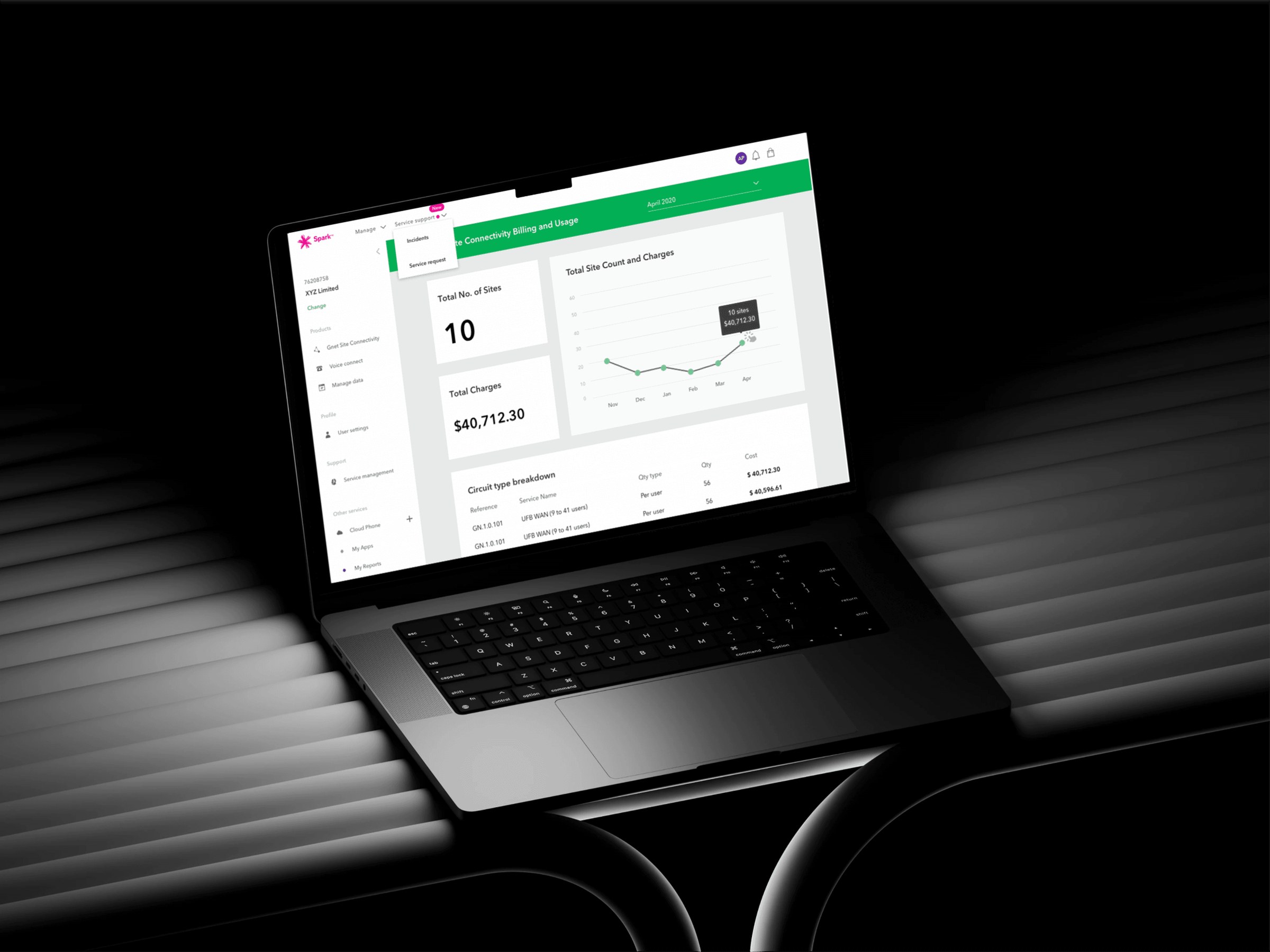
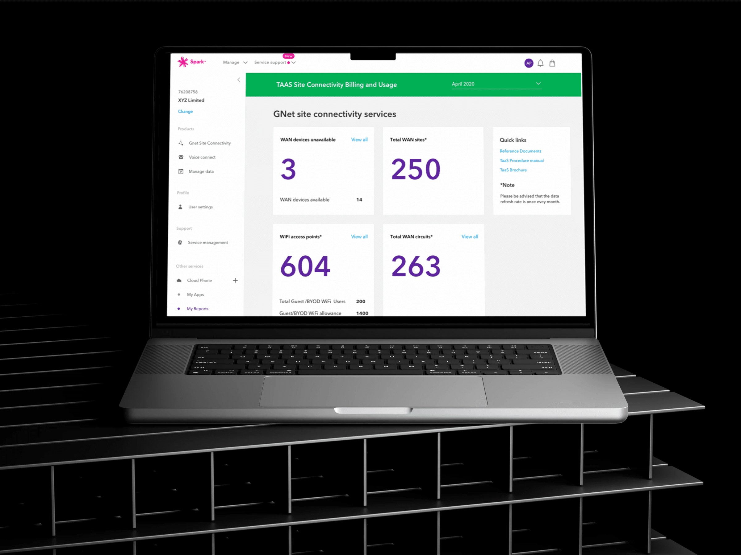
High fidelity screens of the dashboards
Deliver
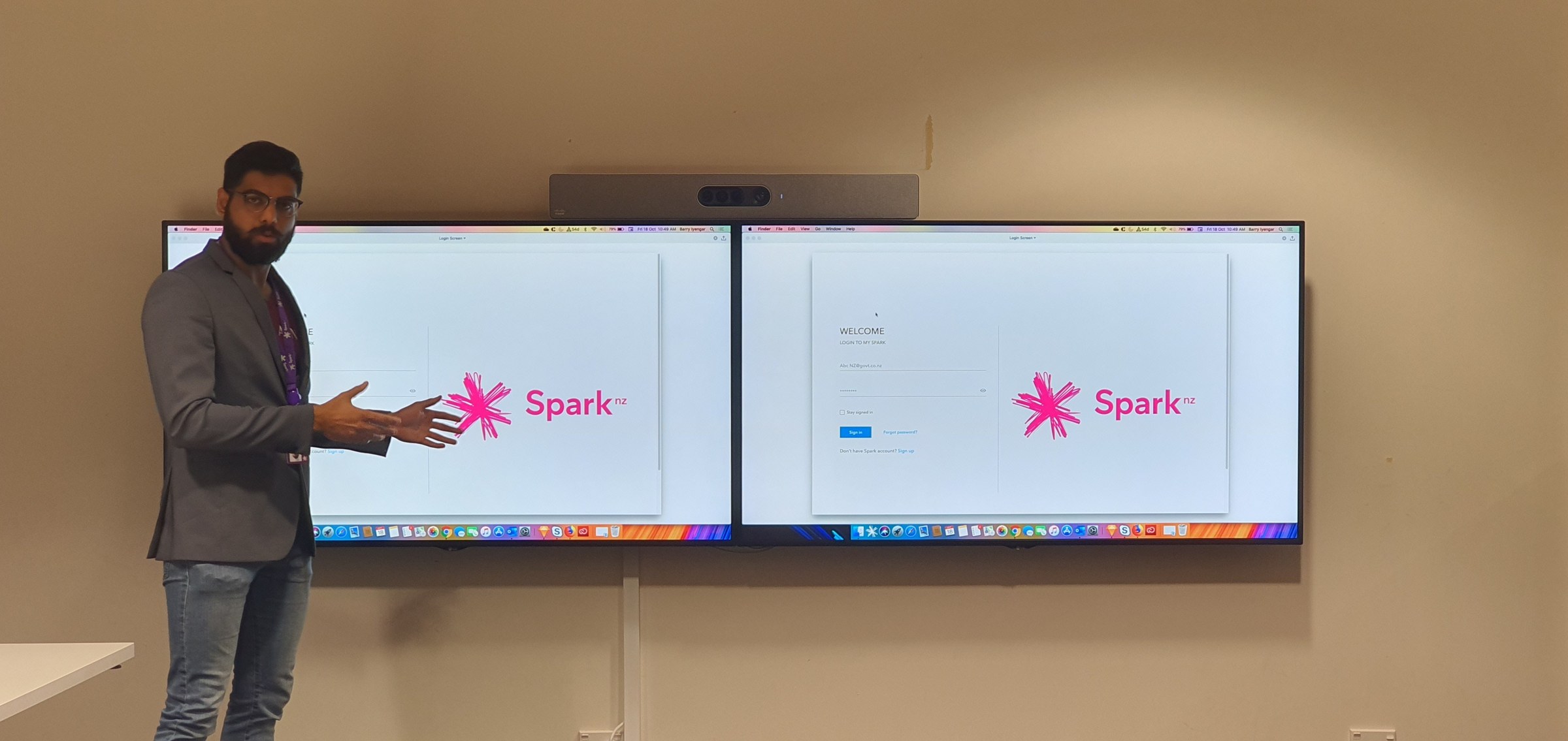
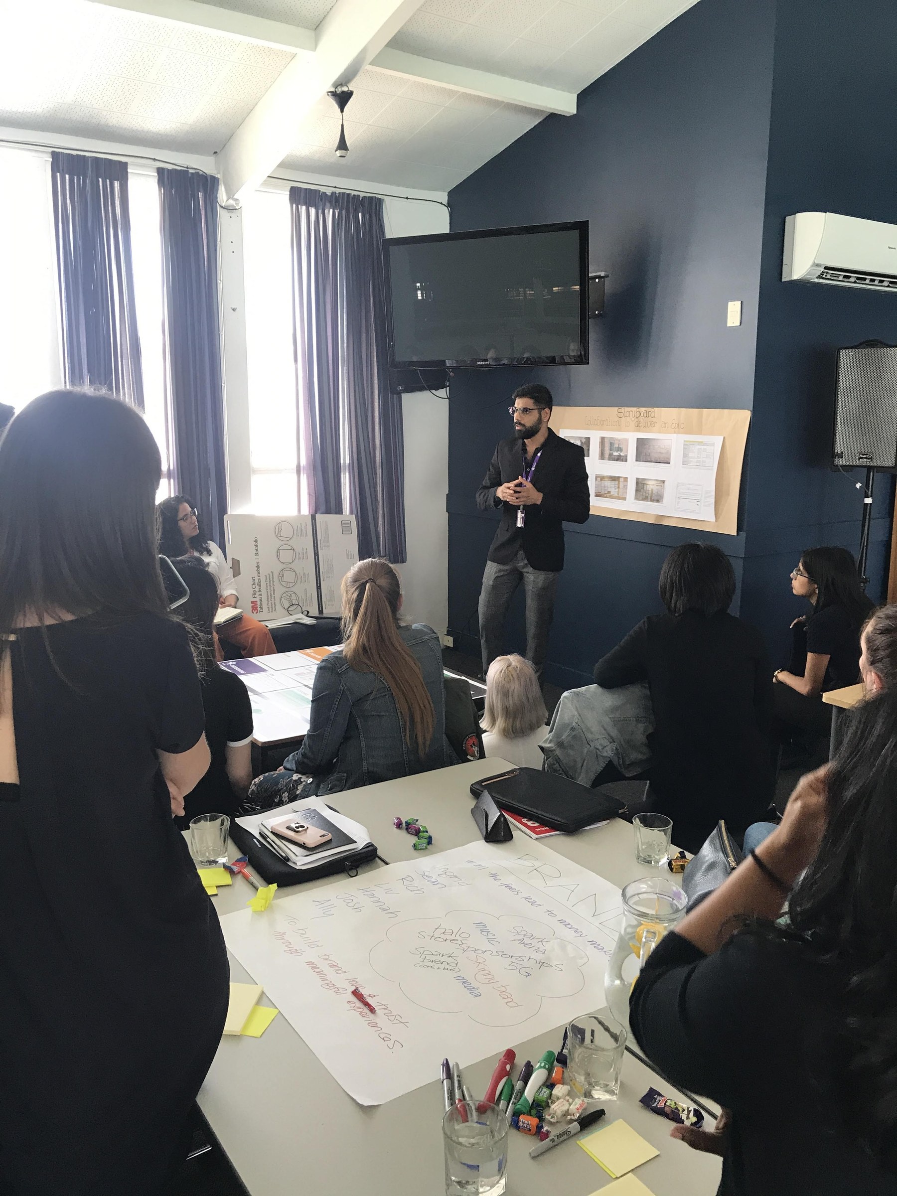
The handover process begins by giving a product demo presentation and explaining the key stakeholders the design features and the interface.
Few screens have been built and rolled out to the pilot customers as a Minimum Viable Product (MVP). The development of the other screens are still under progress.
Customer feedback
Thanks for the improvements made on the portal. These kind of changes make a big difference in our organisations daily activities.
Mr. Watson (Department of Conservation)